Graphing Your Sales Data
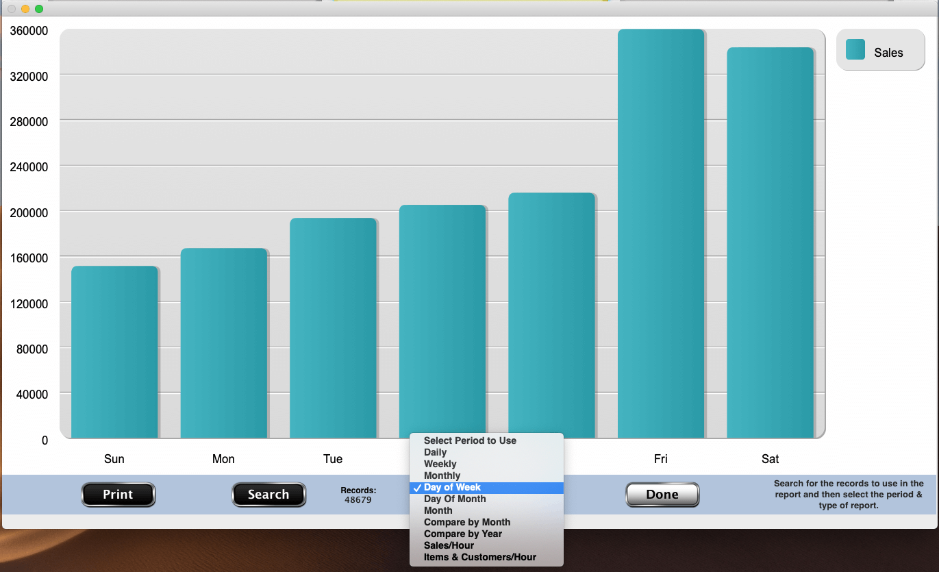
You can now see your sales data in visually. Select a group of sales records and then graph them by each day, by each week, by each month or by the day of the week (shown here).
You can also graph by the day of the month or by the month of the year.
You can also graph comparing the same months over several years or compare several years all on one graph.
There's also graphs for sales per hour and items sold and customers per hour.
All the graphs can be printed for your use.